Case study: BabyCenter app home screen revision
Project overview:
The BabyCenter app is a pregnancy tracker that guides users through the countdown to their baby’s due date. It offers weekly baby growth tracking and provides fetal development videos for each stage of pregnancy.
Our last app home screen was built in 2016. In order to stay competitive in the app marketplace and maintain leadership in the US market, we brought improvements to the app UX and functionality. The new home screen was launched in May 2020 for both iOS and Android Platform.
Business goals & KPIs
Main
Improve engagement, measure:
Screens per session
Sessions per weekImprove retention, measure:
2-7 day retention
Consumer satisfaction, measure:
CSAT score
Secondary
Maintain or improve US download levels
Maintain high app store rating
iOS and Android have a 4.8 star rating
Reduce complaints about UI issues, difficulty navigating the appKeep app build size under 100MB
My roles and responsibilities
I was the lead UX and UI designer on this project. I worked closely with a cross functional team including a product manager, a UX researcher, and an engineer lead. We went through the entire product cycle together from research, design, build, QA, and launch.
Research
Usability benchmarks with competitor’s apps
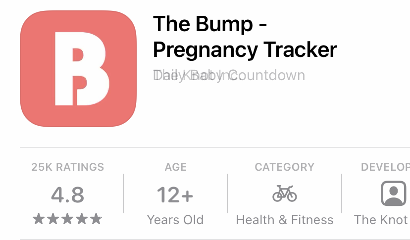
The first thing we focused on was research. We conducted a usability test of our app versus other apps with similar product offerings to BabyCenter. These included What to Expect, The Bump, Pregnancy Plus, and Glow Nurture.
During a usability test, we found that users preferred apps with a dashboard layout because it allowed them to look at their pregnancy status at a glance. We also found the branding color we had was outdated. We needed a color rebranding to go with the home screen revision.
Competitor analysis - app features
We conducted an analysis of our direct competitors, listing out their home screen layout, site structure and app features.
We found half the apps provided weekly content while the other half of the apps provided daily content. We decided to test whether adopting a weekly or daily content strategy would be more engaging.
Competitor analysis - industry trend
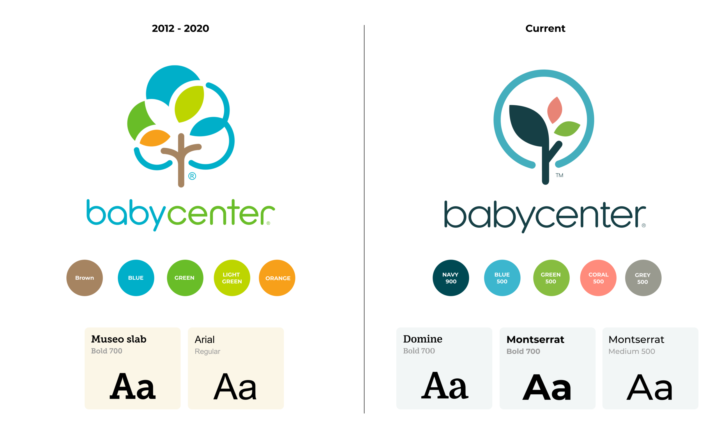
We picked 20 Webby nominee and winners’ sites and apps and studied their branding including logo, font, and color scheme. Based on what we learned, we partnered with designers from our brand team to redesign our logo, font, and color palette.
Problem statement
Here are a list of problem we identified:
Users had to scroll to see their dashboard after the first day of the week.
Users could not identify the important content to read. The layout didn’t convey a visual hierarchy.
Younger users did not read lengthy content.
Users felt the app looked outdated.
Design Goal
Allow users to see their progress at a glance on home feed.
Modularize the content for users to identify the content type easily.
Chop down content into bite-sized layout
Update branding material to match industry trends.
Identify advertisement footprints for monetization.
User persona
We updated our user persona based on the latest data to inform the subsequent design.
Rebranding
Brand team did a rebrand of BabyCenter with logo, font, and color palette.
Lo-fi Wire framing
We mapped out page structure options, and advertisement footprints.
Prototype
We conducted a usability test with 10 participants to help us making design decisions for the most important user pain points.
Design challenge — Dashboard
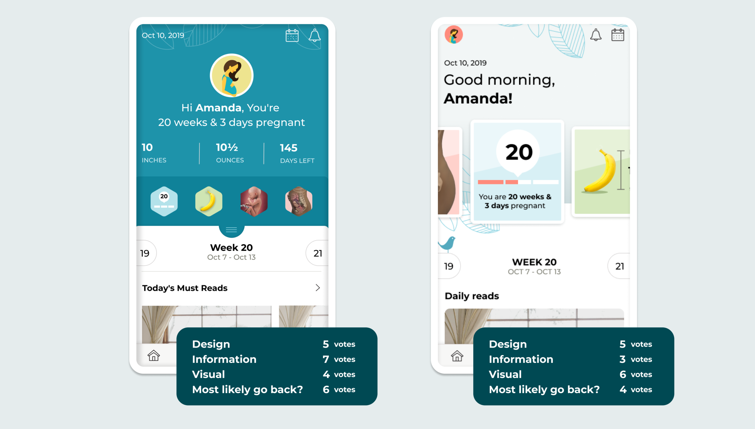
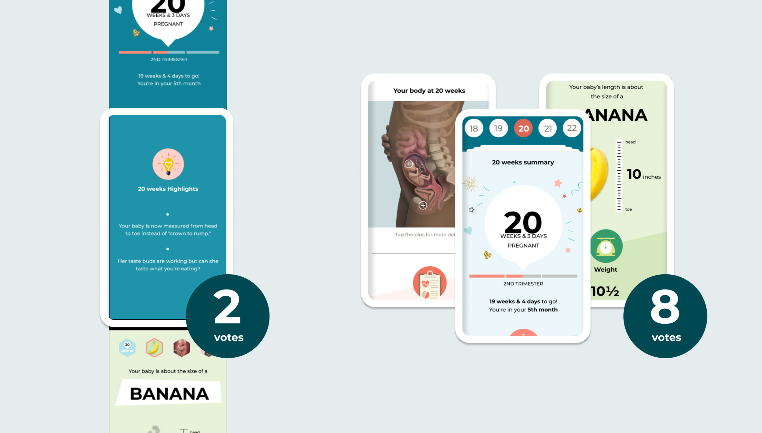
We made 2 options for dashboard for the test. There was no clear winner for it on usability test, overall users liked the rich color and all in one glance on left version, big image on right version. We combined the learning from both design and did a hybrid version for next design.
Design challenge — Weekly and daily content structure
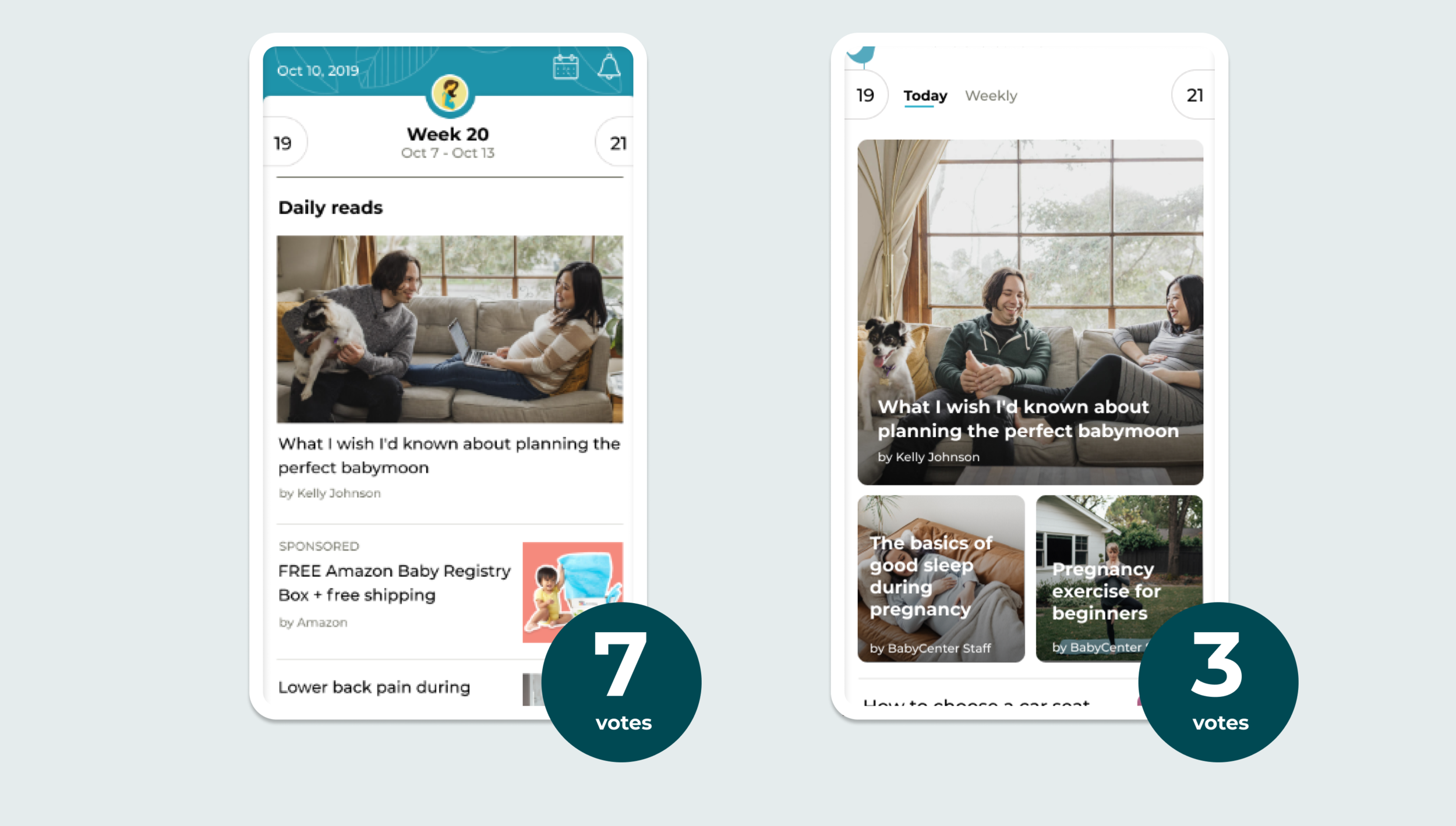
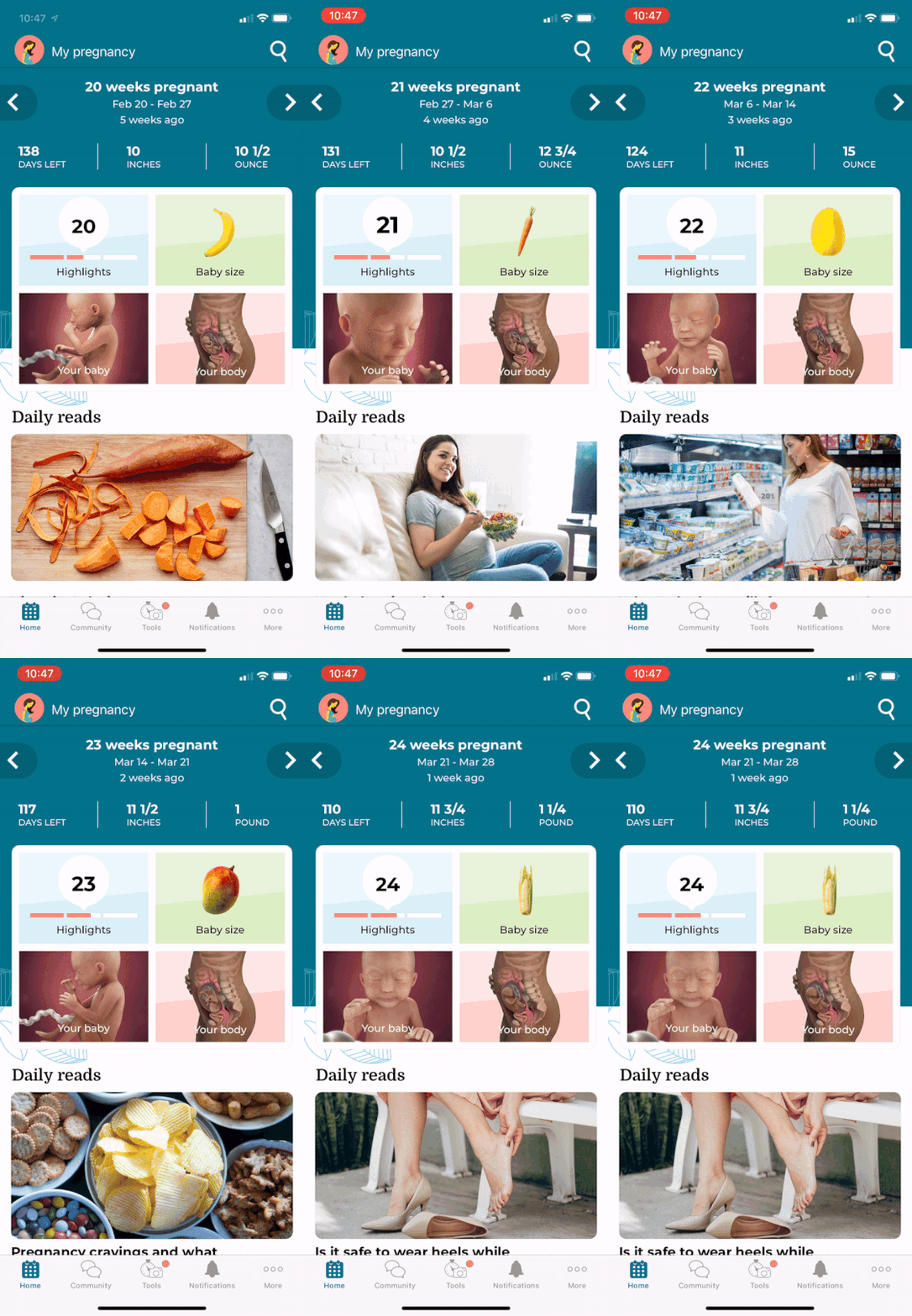
We learned user’s preference in terms of organizing the content. Majority of users preferred seeing daily and weekly content mixed in, instead of separating them into 2 tabs.
Design challenge — Long scroll versus 4 smaller pages
We tested 2 version of pregnancy detail layout. We learned users want to be able to jump to the area they want to see right away. They prefer chop down the information into 4 smaller pages instead of a continually scrolling on the same page.
Final design
Animation Demo
Matrix
App store rating 4.9 (+0.1%), Chart #41 on Health and Fitness
Screen page view had 129% on Android, 56% on iOS
Mobile Satisfaction Score remained the same at 84%
NPS score was raised from 60 to 62
next step
We didn’t stop here. After the relaunch in May 2020, we continue improving the app experience. As for now, we are focusing on refreshing the daily content, improve our article reading experience to match Gen Z’s gesture behavior, more to come!
App store listing
Credit
Product
UI / UX design: Amanda Wu
Product manager: Stephen Klop
Engineer Lead: Jully Lau
Rebranding
Brand design: Stehpanie Porter


